Wireframing: Why You Need It for Web and Mobile App Development
Want to know what wireframing is? In this article, we talk about how to make a wireframe, what the benefits of wireframing are, and which tools you can use to create a wireframe. We also share our own experience creating wireframes for our clients.
What is a wireframe?
One of the most important steps in designing a great UX is wireframing. A wireframe is a simple black-and-white layout that outlines the size and placement of page elements, features, and navigation for your mobile app. It’s a sketch of your mobile app before any kind of design elements are created and before development takes place.
Wireframes allow designers to plan the future layout of the software, test user experience and express features visually
In short, a wireframe is a visual representation of elements in a mobile app. Wireframes purely focus on a mobile app’s structure, giving you an idea of how the app will look without any colors, shading, fonts, or other design elements. It represents the most important parts of a mobile app in the form of grayscale boxes and other shapes to keep things simple.
You can use wireframes to share your vision with the rest of your team. They’re also strong visual deliverables you can pass on to the client.
Three main questions to ask before wireframing
Where should you start with wireframing? The first thing to do is to understand the client’s requirements, and the best way to do that is with a face-to-face meeting or a call. This will help you quickly clarify what your client is looking for from the application and their main business goals. The three main things you should understand before diving into the process of wireframing are:
- What is the purpose of the application?
- How many different types of users will there be?
- What are the expected user flows?
Let’s find out why you should ask exactly these questions. Understanding the purpose of your application will make it a lot easier when it comes to laying out elements on the page and deciding what should take precedence and be given screen real estate. It will also help you understand what you need to archive here. In short, knowing the application’s purpose helps you plan the information architecture and identify user goals.
Knowing who the app’s users are will help you determine how many screens you’ll need in certain cases. Are you going to need a separate login page or a separate dashboard? Who do you need to cater to?
Understanding expected user flows is probably the most important thing when starting to lay out your screens. For each type of user, you need to determine the expected user journey, the actions users are likely to take, and the most user-friendly way to accomplish these actions.
Four tips for creating great wireframes
Here are a few practical tips to keep in mind when you’re wireframing:
- Keep it simple. The key to wireframing is speed and simplicity.
- Use a grid. A grid creates a structure for your layouts. Every decent modern mobile app is built on a grid, so make sure you’re using one in your wireframes too.
- Make short and sharp annotations. Team members actually read wireframes more than any other document. So make sure you add some annotations to your wireframes. Don’t go overboard, though. Keep them brief and to the point.
- Encourage feedback. When sharing your wireframes, encourage feedback from your team members. This is a great way to improve your wireframes. You can stick your wireframes up on the nearest wall and encourage your team and anyone else to give you feedback.
The difference between wireframes, mockups, and prototypes
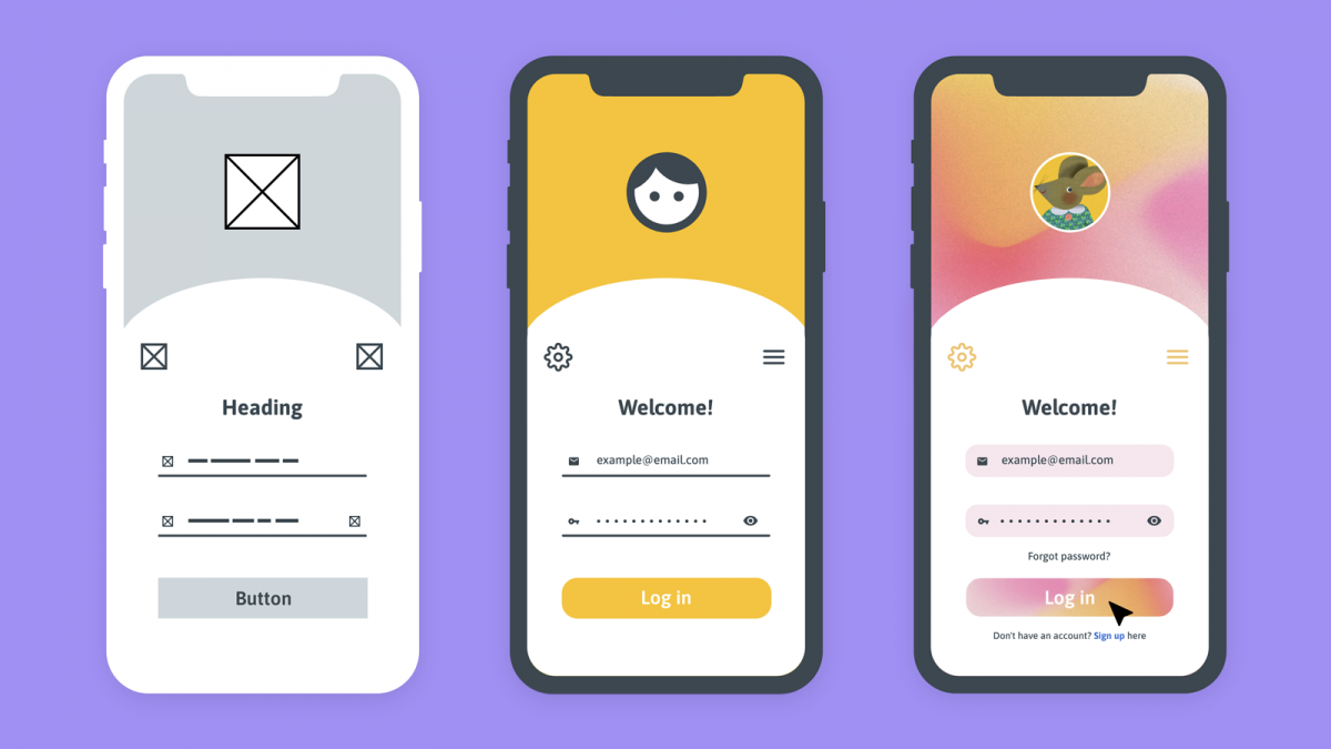
When people hear the word wireframe, sometimes they think about mockups or prototypes. We want to clear up what these things are and show you the difference between wireframes, mockups, and prototypes.
Wireframes
A wireframe is a draft of a product. It introduces the general scheme of your app or shows the layout of its components. Wireframing is usually the first step in the design process. Wireframes may differ in their level of detail. However, all of them present a basic view of the app, showing the intended placement of buttons, icons, text, pictures, and other elements.
Mockups
The next step of the design process is to create a mockup. A mockup not only shows how objects will be arranged but also shows their shapes, fonts, and sometimes colors. If wireframes try to skip all the tiny details, mockups aim to illustrate them. Think of a mockup as a static representation of the final product. It’s where designers decide on the button texts, icon forms, font sizes, and typefaces. Designers also use mockups to set the spacing between elements and determine intervals and gaps.
Prototypes
Once the mockup is ready, it’s time to create a prototype. A prototype is an interactive model that shows the results of taking particular actions in an app. A prototype might not be exactly like the real app; however, it should be very close to the product you’ll present to your customers. The main difference between a prototype and a real application is that a prototype contains test data on the back end.
What should a wireframe include?
The content and look of wireframes depends on their type: low, medium, or high fidelity. There are common elements, though, that you can see in all wireframes. They are:
- logos
- search fields
- share buttons
- headers
- placeholder text (Lorem Ipsum)
High-fidelity wireframes can feature:
- navigation elements
- contact information
- footers
- typography and images
Low and mid-fidelity wireframes don’t contain any images or typography, but designers can express the content hierarchy through text sizing.
Wireframes are usually grayscale, so designers use various shades of gray to represent colors. In high-fidelity wireframes you can even notice color sometimes, like red for error messages or blue for active links.
Why is it important to create a wireframe for an app?
We’ve talked a lot about what wireframes are. Now let’s find out why it’s so important to create them.
Visualize the mobile app architecture
A wireframe is the first step in visualizing a project. Wireframes allow mobile app design teams – from UX to copywriting – to start considering the aims of users. It includes the architecture of the mobile app, the navigation, the organization of pages, the users’ flow through conversion funnels.
Understand exactly how your app can help users
One of the most important reasons to create a wireframe for a mobile app is that it can provide you with a clear vision of how your users will use the app. To achieve success, it’s extremely important to know how to solve users’ pain points.
Wireframing helps you answer the question, Can my mobile app solve my users’ problems?
Save time and money
When you decide to wireframe first and develop second, you reduce cost overruns, often by as much as 95%. This also accelerates programming and keeps costs from spiraling out of control. Low-fidelity wireframing drastically reduces technical debt, one of the most costly long-term project killers overlooked by many small business owners.
Identifying and resolving flaws during wireframing will save you a lot of money that otherwise would be spent making changes during development or even after the release.
Iterate fast and avoid future issues
When making a wireframe for a mobile app, your goals are to solve a pain point for your users and create a great UX. However, it might take a few tries.
One of the greatest things about the wireframing process is that it’s not time-consuming. This makes wireframes perfect for fast iterations. Here’s what the full cycle looks like:
- The team makes a wireframe for the mobile app.
- The team shows this wireframe to the client or a focus group to gather feedback and discover possible pitfalls at an early stage.
- The team updates the wireframe based on the feedback.
- The team repeats this sequence as fast as possible and as many times as needed to reach the client’s goal.
A wireframe is great if you need investors, as it gives you a solid visual representation that you can use for pitches.
Plus, it’s much easier to make changes at the wireframing stage than at the development stage.
Avoid mistakes
Making a wireframe for a mobile app will help you lay out the functionality of each screen. With wireframes, you’ll understand what features should go first and if there’s enough space on certain screens to place everything you need. Wireframes allow you to prioritize content effectively. By designing the hierarchy of elements for each screen, you can see if everything is fine with the user journey.
Clarify software features
Wireframes clarify what steps each feature entails. They visualize features and make them more “real” rather than a mere description. This will allow developers and other team members to see what exactly they need to build to create a feature.
Prioritize your product’s usability
Wireframes allow you to see features from the user’s perspective. As I mentioned earlier, wireframes give you a step-by-step user journey. This allows you to evaluate how clear the path is, or if there’s any confusion down the road. Elegant wireframes with clear paths and logical relations between screens are key to usability.
Make your design process iterative
Wireframes aren’t just a visualization for your future product. They are a powerful tool for UX testing. You can treat your wireframes like a low-fidelity prototype and test your user experience design with a focus group, early users, or stakeholders. This will allow you to gather feedback and have a visual basis for your discussion, leading to better UX design decisions.
Five tools for making wireframes
Sure, you can make wireframes with just a pencil and paper. However, today we’re talking about professional wireframing, so let’s discuss professional wireframing tools.
Axure RP

Axure RP is a desktop app that lets UX designers make, test, and share interactive prototypes. It has been called the most comprehensive wireframing tool in terms of functionality. Axure is the perfect software for static and low-fidelity wireframes and even for more complex interactive prototypes. Note that Axure is an extremely professional UX tool that has a steep learning curve.
Balsamiq Mockups

Here at Mobindustry, we use Balsamiq Mockups to create wireframes. Balsamiq includes several drag-and-drop elements, from buttons to lists, each styled as a hand drawing.
This lets us create intentionally rough and low-fidelity wireframes to encourage as much feedback as possible from our clients.
Photoshop CC

Some might say that Adobe has some of the best design tools. The thing with Photoshop is that it doesn’t offer libraries of interface elements, but it’s perfect for straightforward, fast wireframing. Photoshop CC makes it simple to sketch quick ideas, group elements and layers, and build an effective wireframe.
UXPin

UXPin is a tool for rapidly creating wireframes. You can just drag and drop the elements you need and the work is done. UXPin comes with regularly updated libraries for Bootstrap, Foundation, iOS, and Android, and you can use it to quickly and easily convert your wireframes to high-fidelity mockups. UXPin even lets you create a fully interactive and animated prototype of your final product.
Mockplus

Mockplus is an all-inclusive fast prototyping tool for professional UI/UX designers that has a shallow learning curve. It has everything you might possibly need to create wireframes.
Main steps to creating wireframes
Step 1. Do research
To create effective wireframes, you need to empathize with your end user, and know their goals and expectations. To do that, you need information. Create a user persona, research the market, interview the product owner about their typical customer, and explore the industry standards.
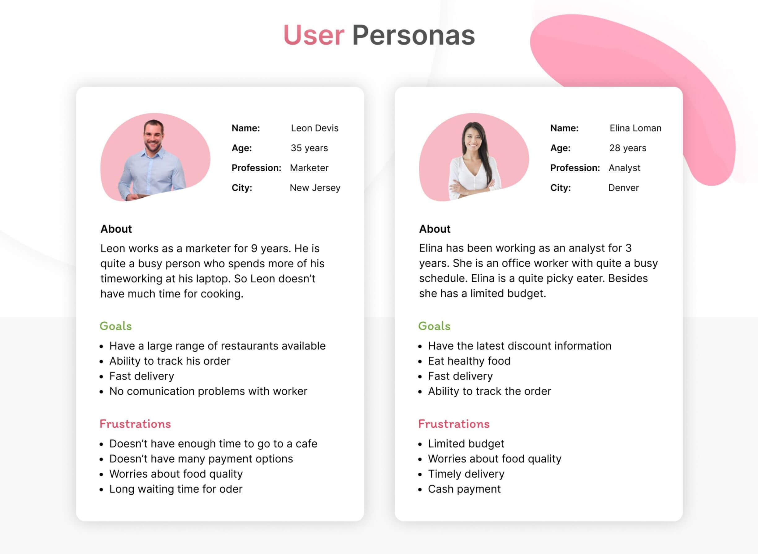
Step 2. Identify the user flow
What do users do in your app or on your website to achieve their goals? What they search for, and what steps do they need to take to get to the final destination? Answers to these questions will show you the user flow and allow you to structure your features. Search for potential outcomes. What’s a perfect user journey? What can go wrong and why? What will you show to your user in this case?
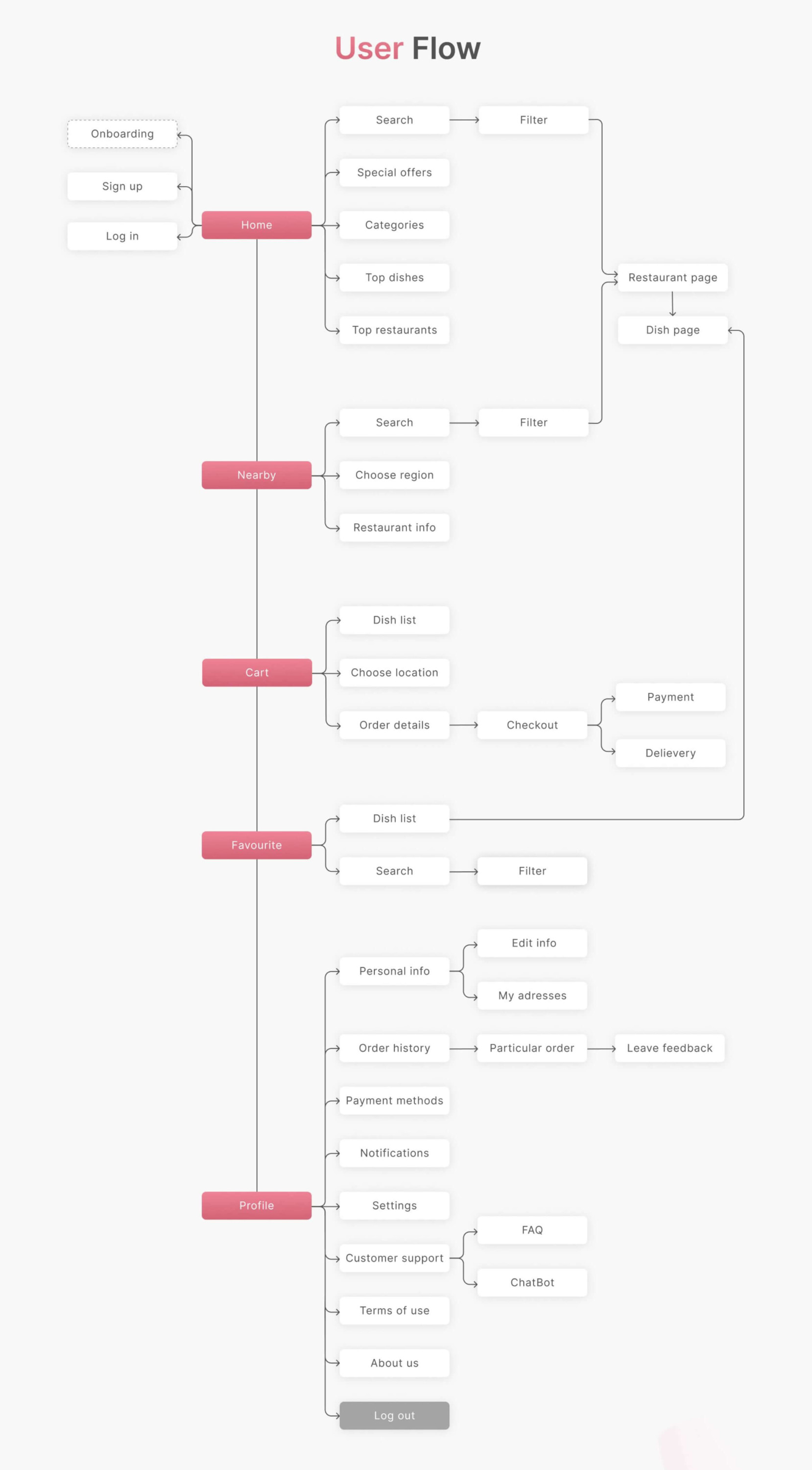
Step 3. Determine the features
Now it’s time to polish the structure of your app or page and its features. There are countless ways to organize and place features on a page or screen, and their position will likely change multiple times while you discuss this with other team members. Apply time-proven design principles, your research and a user-focused outlook to display content in an optimal way.
Step 4. Create the wireframe(s)
Designers and business analysts approach creating wireframes in different ways. Some sketch the screens and their transitions by hand on paper. Others use digital tools like Adobe XD, Figma, or Balsamique. No matter what approach you take, keep your wireframes simple, minimalistic, and low on detail.
Step 5. Test
Now it’s time to run UX testing. You can use both freehand or digital wireframes and create a prototype for your test group. Don’t just give a prototype to your users and gather their feedback. Instead, lead the testing process by asking your users questions. Is the prototype easy to navigate? Do they understand what feature this is? Do they experience any confusion? A guided testing session will allow you to gather valuable feedback and refine your prototype.
Step 6. Create a mock-up
At this stage, you breathe life into your wireframes and add color, images, text and other UI elements. The user experience is already decided on at this stage, and you create a mock-up for your development team so they know where to put the feature elements on top of their working business logic.
Wireframing at Mobindustry
Wireframing is a creative process. Here at Mobindustry, it’s in the good hands of our business analysts. They work to understand your requirements at a high level: Who will use the mobile app? What is it supposed to do, and how? Based on this information, they start making wireframes bearing in mind the needs of potential users.
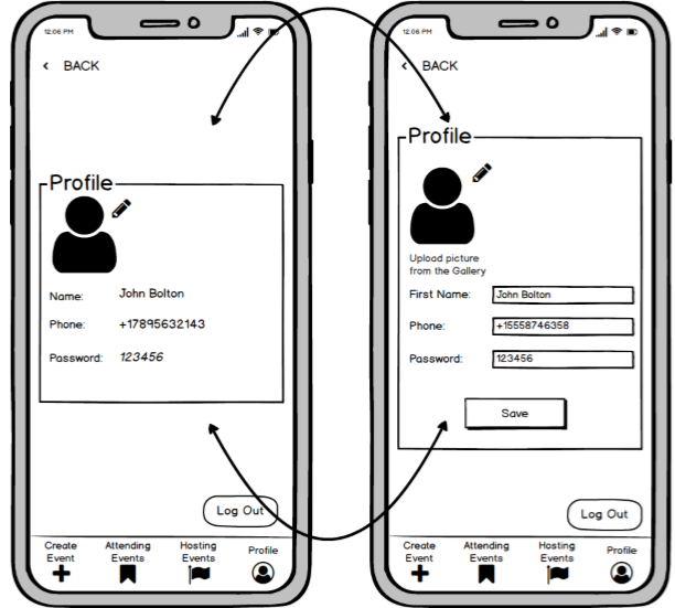
We use Balsamiq Mockups to make wireframes that are black and white in a pencil drawing style.
For the majority of people, it’s easier to perceive information in a visual form. Still, we add brief descriptions to our wireframes to give context and make it easier for developers to create interfaces.
If necessary, we add links to wireframes so you can see how users will interact with your app at an early stage.
Our company uses agile and Scrum for all development processes. Combined with our creative approach, this results in clients getting fully ready products.
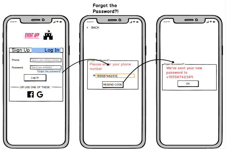
We don’t wait for our clients to tell us what to do and how. We’re a team of professionals that propose the best solutions — and of course, everything then needs to be approved by the client.
The cost of wireframing depends on the scale of the app and its functionality. The same can be said about the time spent on the wireframing process. The time required starts at one and a half weeks and grows depending on the application.
Quick summary of wireframing
We hope this article has shed light on the world of wireframing. Here are the key takeaways:
- A wireframe is a simple black-and-white layout that outlines the size and placement of page elements, features, and navigation in your mobile app.
- Before making wireframes, answer the following questions: What is the purpose of your application? How many different types of users will there be? What are the expected user flows?
- The key to wireframing is speed and simplicity.
- Team members read wireframes more than any other document.
- When sharing your wireframes, encourage feedback from your team members.
- One of the most important reasons to create a wireframe for a mobile app is that it can provide you with a clear vision of how users will use the app. This makes wireframes perfect for fast iterations.
If you want to create wireframes for your future mobile app or if you have any questions regarding this topic, contact Mobindustry for a free consultation.

