Month: June 2022
Нow to Test UX Design of Your Applications: Challenges and Methodology
Intentional and thought-out user experience is able to bring a business infinite benefits. According to Forrester, strategic UX can raise conversion rates by as much as 400%.
Bad user experience, on the other hand, can harm a business’s reputation and cost them hundreds of potential customers and hundreds of thousands of dollars in revenue. According to Web FX, the website or app design affects 94% of all first impressions of a brand. This means, that users make conclusions about your brand and business immediately after first seeing your digital product.
Bad user experience can harm a business’s reputation and cost you hundreds of potential customers and hundreds of thousands of dollars in revenue. The website or app design affects 94% of all first impressions of a brand.
The same study shows that 89% of users will immediately turn to a competitor after having poor experience on a business website or in an application. As you can see, the damage from not paying your UX enough attention can be devastating. With that said, only 55% of businesses invest in mobile usability testing of their products.
In this article, we’ll talk about the importance of UX testing, discuss the best practices of usability testing for mobile apps and follow the whole process of testing user experience step by step. Let’s start with defining UX testing.
What is usability testing in mobile application development?
Usability testing for mobile apps is a set of practices that allows QA specialists, developers, and product designers to check whether their mobile application is convenient to use and whether it allows users to achieve their goals in the app in the most optimal way.
User experience testing uses real scenarios and lots of experiments to figure out the best user experience, which depends on all parts of the app design: from the color of the buttons to the transition between screens and their hierarchy.
Usability testing vs UX testing
There are lots of terms that describe this kind of testing: UX testing, usability testing, product testing, design testing, etc. In this article, I’ll be mostly using two terms: usability and UX testing. Is there a difference between them?
Usability testing investigates how a product is used by users to achieve certain objectives. The main goal of app usability testing is to discover how easy it is for users to find a way to their goal, how clear the interface is, and how many hurdles users encounter during their experience with an app.
User experience testing uncovers the user perception of the application: how a user feels, what emotions they experience, how they behave in an app, and how exactly they use a product.
As you can see, both these types of testing focus on how consumers use the product. That’s why in this article I’ll be using both terms interchangeably, however, it’s useful to remember the difference between them and include both practices in your design testing.
Why perform UX testing for your mobile app
Way too often business owners and even some product designers fall into the trap of assumptions and invest huge sums of money into hypotheses that aren’t confirmed by hard data.
A professional can be sure that their UX design will work, but this should be tested in real-world situations before it goes live. Why?
UX design often determines the success of a software project, and the statistics I mentioned above prove it. Businesses simply cannot afford to invest thousands of dollars into applications with designs that might not work. Building a simple prototype and testing it, however, is much more cost-effective than rolling out a product with experimental UX.
Before investing in mobile application development, it’s important to make sure your design helps you and your future users meet their goals. Fixing an already existing product is costly, and requires lots of time and effort. However, this doesn’t mean that the UX testing should happen only at the beginning of the app development process. As your business evolves along with the market, new features, standards, and expectations arise.
So, when is it important to perform UX testing? Let’s find out.
When should you test your mobile usability?
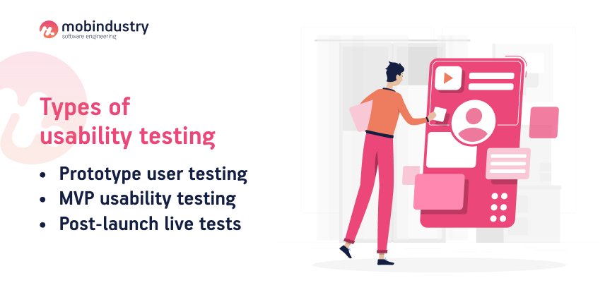
Mobile app usability testing can happen at different stages of mobile app development, and it should be a part of your vendor’s UX design services. Depending on when the testing takes place, there are the following types of testing:
- Prototype user testing
- MVP usability testing
- Post-launch live tests

Prototype user testing happens at the initial stages of development when you already planned your application’s functionality, and now need to check the best possible user experience and design for it. At this stage, you should already have a technical specification and wireframes.
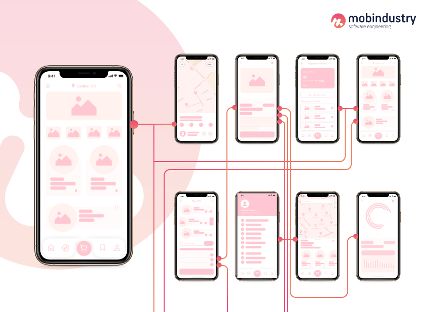
Wireframes will be your primary tool for experimentation. Think through the transitions between screens and the placement of UI elements on each screen. If you want, you can take your prototype testing to the next level and create a clickable demo that you can show to your focus group. This will provide you with even more insights.
MVP usability testing allows you to check your product in real-world conditions without investing lots of time and money into a fully-fledged product. To perform MVP testing, you need to develop a technical specification, and then prioritize the minimal scope of functionality that will allow your users to achieve their goals in your app.
Then, after you develop your MVP, integrate analytics into it and release it for users. You’ll be able to watch how they behave in your app in real-time and develop your product further based on the insights and feedback you get.
MVPs are used not only for usability testing but also to check the market fit and make sure that the idea of the whole application is viable.
Post-launch live testing uses the same principle as MVP usability testing: track your analytics and find any potential issues and bottlenecks in your user experience design after the product is fully live. At this stage, you’ll get the most accurate insights about your app’s UX design.
Perform regular post-launch testing to make sure your users accept new features you add to your application, and changes you make to your interface.
Methodology of usability testing
Before we talk about the methodology of UX testing, let’s describe its main actors and metrics, so we are on the same page.
Participants in the usability testing
Each type of usability testing involves three main types of actors:
- Test users or participants
- Facilitators
- Stakeholders
Test users are the representatives of a business’s target audience. They are just like the people who will use your app once it’s live. Make sure to pick the right people as your users, and choose representatives for all segments of your TA.
Facilitators are usually the UX designers and professionals who conduct the process, observe the users and create tasks that participants should complete in an application.
Stakeholders are all other people who are involved in the development and business processes, who may have strong opinions on how your app’s UX should look like. They include developers, QA specialists, product and business owners, and so on.
Let’s talk about the main methods of usability testing for applications. In these mobile app testing techniques, there are only two pairs of parameters:
- remote/in-person testing
- moderated/unmoderated testing
A combination of these parameters gives you a whole list of mobile usability testing methods. Let’s discuss each one of them.
Remote vs in-person UX testing
These two approaches are valid and have their pros and cons. Many UX testers and designers recommend only remote user experience testing. The reason lies in human psychology: we change our behavior when someone observes us.
A facilitator of the session may become a factor that will influence the result of UX testing, and it’s in your best interest to get the most accurate results.
On the other hand, in-person testing has its perks too. You can watch your participants and detect the non-verbal signs of confusion such as sighs, frowning, and tension. Also, participants tend to be more focused on your tasks, when they’re being watched.
The choice is yours: you can conduct UX testing by running usability tests remotely and using special UX testing tools or have an in-person testing session.
Moderated vs unmoderated UX testing
The difference between moderated and unmoderated sessions lies in whether you attend them or not. During a remote moderated session, you can have a video conference with a participant, answer their questions, set additional tasks, and provide clarifications. You’ll see everything a participant is doing in real-time.
Unmoderated tests happen without anyone watching, so you just get data about the session from each mobile device and can get any type of feedback from the participants.
The testing procedure and stages
Let’s now discuss the whole process of UX testing. So, the usability testing checklist for mobile application includes the following steps:
- Creating a prototype
- Developing a plan
- Recruiting participants
- Picking a location
- Moderating the test
- Documenting the results
Now we’ll talk about each stage in detail.
Step 1. Create a prototype
First, you need to build something for your users to work with. If you’re at the initial stages of mobile app development, you need to build a prototype. A prototype is an early version of your future product with limited functionality.
Prototypes come in many forms, and your choice depends on your budget, goals, timeframe and the stage at which your development currently is. You can use sketches, wireframes, high-fidelity mockups, functional prototypes, or even an MVP version of your application.

There are multiple tools you can use to create prototypes out of something as simple as just sketches. I, however, recommend that your prototypes are interactive: for example, you can tie wireframes together in InVision.
Remember that you don’t need any complex UX prototypes for your testing to be effective. However, it’s always a good idea to build several versions of your prototype, so that your participants have something to compare and choose the best version.
Step 2. Develop a test plan
The testing can quickly become chaotic without a plan, so you need to prepare, set goals and think through the whole process. In order to build an effective plan, you need to define:
- What you’re going to check. This can include features, functions, tasks
- What your metrics are. Usually, the user experience metrics include the success and failure rate of tasks
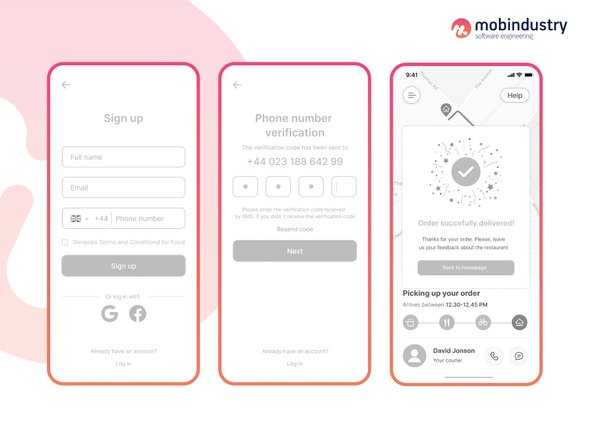
Go through the whole user journey in your future application, and write out the tasks they need to complete. For example, if you’re building a food delivery app, the tasks may be as follows:
- Finding restaurants nearby and choosing one of them
- Finding a specific dish
- Ordering food to their home or office
- Tracking and receiving an order
Now that you’ve defined what your users should be able to do in your app, it’s time to ask questions like:
- Are users able to quickly find and choose a restaurant?
- Is it easy to order a dish and provide a location?
- Are they able to track an order?
Your plan should look like a table with these columns:
- Names of participants
- App features that you want to check
- A place for notes if there’s confusion at any point of the session
Then, after running the test, you can calculate the success rate of each version of your prototype, and compare them.
Step 3. Recruit your participants
If your product is already live, it’s easy to find a participant group for your user experience testing. Just ask your sales team to get customer contact information. If you’re only starting to develop your application, you may be tempted to ask your friends, partners, acquaintances or other stakeholders to check your app. This is a mistake.

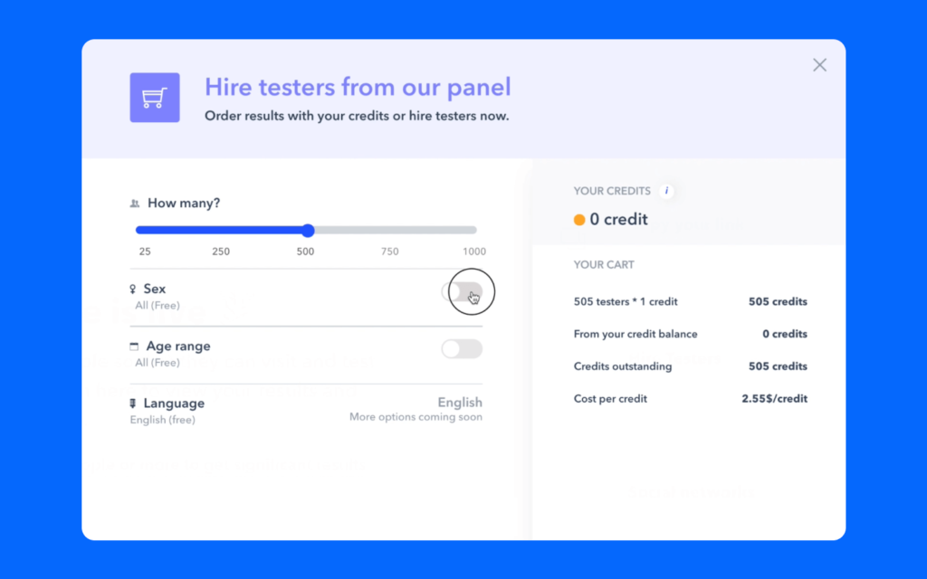
You need to get objective data about your UX ideas, so make sure your group of participants is unbiased and also belongs to your target audience. Services like Usertesting, Validately, or Verifyapp are places where you can find your participant group.
Some companies also choose to run an ad or promo campaign way before the project is released or even developed, to check the market response and demand for their product. You can follow similar tactics and recruit people who were interested in your product in the first place. Offer them future discounts, special perks, or other bonuses for participating in your test.
Step 4. Find a testing location
Finding a place for your sessions depends on the strategy we discussed above: remote or in-person, moderated or unmoderated. If you plan to run an in-person session, you need a meeting place where any distractions are minimized. I’d recommend cafes or coworking environments, where users can be relaxed enough and focused at the same time.
For remote testing, you can use any video conferencing tools like Zoom and Skype, and also UX testing tools for monitoring user behavior in real-time.
Step 5. Run your test
Running a usability test is very similar to setting up a scene and directing it: you need to provide your group with the necessary context, time frames, accurate questions, and tasks, in order for the test to run smoothly. This is called moderation.
Don’t make your test too comfortable for your group: they still need to have limited time to complete tasks and behave as if they were in a real-life situation. To release the tension and achieve more natural behavior, remind your participants that they aren’t on the test — the design is.

If you conduct a remote session, don’t forget to record the whole process. Thus, you won’t have to constantly take notes, and instead, you’ll just watch and observe. You should record the screens of your users to watch how they’re behaving in your app, but don’t forget to also record the users themselves: get as many cues as possible from their mimics.
During a moderated session, don’t hesitate to ask insightful questions about your user experience, especially if you sense some confusion.
Here are just some of the questions you can ask participants during the session:
- Is there any confusion? What stops you?
- What do you expect to happen after clicking this button?
- What do you like most about this product?
- Did you find anything to be unexpected or confusing?
- What is missing?
- Would you use this product today?
Step 6. Document the results
Now it’s time to summarize all your findings in one report. Write out the main issues that your group has encountered, and highlight the areas in need of improvement. The final documentation can look like this:
- Spreadsheet with names of participants, tasks, and notes
- A screen recording
- A video recording
- List of complete/incomplete tasks
- Written feedback from participants
Now you can study your documentation with your team, and make changes to check them later again during the next iteration.
How to do usability testing effectively
Let’s sum up and find out the main principles of effective usability testing of mobile applications. Here are several tips for you.
- Don’t spend too much time on your prototype. Going into too much detail and spending over a few hours is a waste of time. Of course, the discovery phase takes longer than that, but if you need to check some UX ideas, make sure you create a simple prototype that doesn’t take days to finish.
- Know when to stop testing. After each session, you need to gather data and calculate the success rate for your tasks. Once the success rate hits a 90% mark, you can stop testing — your prototype is already usable. After this, it’s time to get to work and develop an app based on your most successful prototype.
- Don’t get fixed on a single idea. Sometimes designers and stakeholders come up with ideas for UX and get attached to them. UX testing is designed specifically for avoiding biased decisions, so don’t be afraid to be mistaken. The whole process should be treated as a series of experiments, that will help you make the best decisions for your business and your real users.
Challenges that you can face during UX testing
Mobile UX testing is still rather young, and not so many companies conduct it regularly, so you can be a bit confused about the algorithm. Let’s talk about the potential challenges of UX testing, and how to overcome them.
Finding the participants
Your participants should be representative of your target audience, and it may be hard to find the right users for your product. Above I mentioned some resources where you can find volunteers, but even if you set up the demographics, they may not be your target users.
This is especially true if you build an app for a specific audience, for example, for people who play a particular sport or people of a certain profession. In this case, you’ll need to put in more effort to involve people from your specific target audience.
Getting enough participants
Checking your app with a couple of users may not be informative: to derive insights, you need to cumulate more data. When you don’t already have thousands of users, you’re just starting to develop your product, it can be hard to find enough people to participate in sessions. Moreover, even those participants you found, can opt out if you hold too many sessions.
So it’s important to pick your battles, prioritize the features or UX patterns, and be in constant search for new participants.
Prioritizing user testing
In the hectic world of software development, it’s very easy to forget about the importance of checking UX. Usually, both developers and stakeholders are too focused on getting things done, developing features, keeping track of KPIs, and so on. User testing often gets pushed back in the schedule, and this is a huge mistake.
As a result, you’ll likely learn lots about your product: for example, discover features that no one actually uses. Regular UX checking will not only allow you to improve your product but also get rid of all unnecessary functionality. This will accelerate your development and let you save budget and effort on developing something that matters to your users.
Final thoughts
In this article, you’ve learned how to do usability testing for mobile applications. User experience or usability checking is a very important part of the development process, that is very costly to overlook. This type of testing allows you to get a real picture of how your product is being used, and how you can improve it for your users. Why does it matter? Users define the success of your business, so it’s important to learn what’s important to them.
It’s proven that asking users about what they want doesn’t work. Noticing their natural behavior, however, helps very well: you can see what features they use most, what they are confused about, what difficulties they encounter, and what overall impression they get from your product.
By checking UX you can get rid of unnecessary features in your plan, and boost your future revenue and conversions by improving the user experience in your app. We at Mobindustry encourage our clients to do regular mobile user experience testing.
If you’d like to check UX in your existing app, or you’re just thinking about testing your app idea in real life, don’t hesitate to contact us: our UX designers and QA specialists will be happy to help and create a perfect mobile app usability testing checklist for you.

