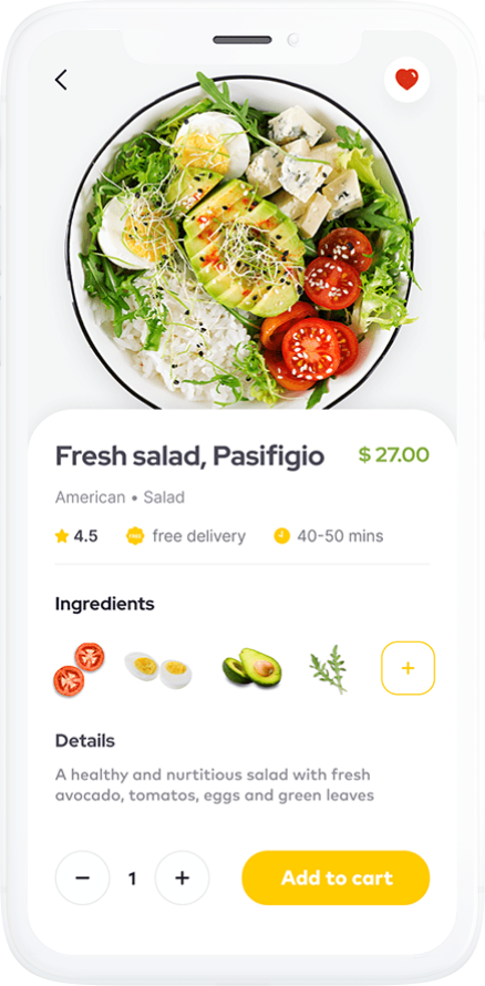
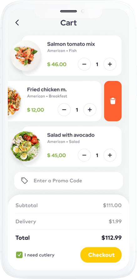
Food Delivery App MVP
development
release
Background
Our client is an entrepreneur who wanted to enter the food delivery market and tested their idea with an MVP before investing in a custom food delivery app. Our client came to us with a white-label application they purchased to test their idea on the market with minimal investments. However, the white-label application wasn’t sufficient, so our client needed to improve it and customize it by adding a few features necessary to launch their food delivery service.
Project idea
Our client’s idea was to purchase a cheap white-label application and release it to test the demand for food delivery in their target market. However, the application they purchased lacked some necessary features and required major customization.
Some of the app’s services weren’t suitable for their audience, such as an Indian payment processor that wasn’t popular in the target market. Also, the white-label application had issues with performance and didn’t have an admin panel for the app owner.
The white-label application had the following features:
- Personal profiles
- List of cuisines
- List of restaurants
- Geolocation
- Top restaurants
- A carousel of images on the main screen
- Restaurant profiles with pictures and descriptions
- Restaurant ratings
- Restaurant menus
- Filters and search
- Map with restaurants
- Settings
- Favorite restaurants
- Order history
- Social sharing
- Checkout and a payment gateway
- Order settings (delivery time, delivery method, payment method)
Goals
- Conducting a code audit and improving the architecture and code quality for the white label application
- Adding new features to the existing code
- Creating an MVP and a simple courier app
- Analyzing the client’s target market and choosing the most suitable technologies and integrations for the MVP
- Customizing the design of the white-label app to get around customization limitations
- Improving the product’s performance, scalability, and flexibility
- Successfully releasing the app to app markets
Challenges
The challenges of this project included:
- Tight budget and deadline
- Low quality of the initial code of the white-label app
- Issues with the app architecture and scalability
As you can see, the challenges were mostly technical. Let’s see how the Mobindustry team overcame them and how the development process went.
Development process and results
Our first step was to interview our client and determine their requirements and business goals. Along with that, we performed market and competitor research to determine what features and integrations should be added to the MVP.
Because the project wasn’t meant to be developed from scratch, we gathered all the requirements and performed a detailed code audit of the white-label application.
Our developers discovered that the application had issues with scalability and integrations. It also had lots of spaghetti code, so we offered to refactor the code and improve the architecture before adding new functionality.
Now our development team was fully ready to build new functionality according to the client’s requirements. Here’s the list of modifications, new features, and components we built for this food delivery service:
Payment gateway. We removed multiple payment gateways that were irrelevant to our client’s target market and integrated UAPay, one of the most popular payment processors in Ukraine, where our client intended to test their business idea. We chose UAPay because it supports different payment technologies like Google Pay and Apple Pay.
Maps and geolocation. We integrated Google Maps and added new functionality such as the ability to estimate delivery times. We also customized the maps and created tabs that showed restaurant names and ratings.
Coupons. We integrated the coupon system into the MVP so users can order delivery on discounts and thus help our client attract customers to their app once it’s released.
Language support. The white-label application supported over 50 languages, but since our client planned to launch their business in just one country, we removed most of these languages and left Ukrainian, Russian, and English for the target audience.
Design. As white-label apps usually come with a generic design, we helped to customize the application according to our client’s brand aesthetics. We modified the following:
- Name
- Logo
- Main page
- Maps and pins
- Color scheme
- Size and form of UI elements
Search and filters. We improved the search and filters that were already present in the application by adding new restaurant categories and adding filters by restaurant rating and average check size for two people.
Admin panel. The white-label app only had functionality for customers, so we built an admin panel where our client could manage orders, view order statuses, send push notifications, change content in the application (such as restaurant descriptions and pictures), and see analytics.
Integration with a POS. We integrated the food delivery app with the most popular point of sale systems for the restaurants in the target market, including Poster, YUMA, and R_keeper. These systems allow restaurants to see orders as they’re placed in the system.
Courier application. We also created a courier application that had the following features:
- Signup and login with authentication
- Personal profiles
- Active orders
- Order statuses
- Maps and geolocation
- Push notifications
Our team that worked on this project comprised:
- 1 Flutter developer
- 1 backend developer
- 1 business analyst
- 1 UI/UX designer
- 1 quality assurance specialist
- 1 project manager
Other team members from our client’s side:
- 1 product manager
- 1 quality assurance specialist
- 1 DevOps
Main features of this project
Maps and geolocation
Users can see restaurants in their area and get information about them by tapping on an icon. Maps also show estimated delivery time based on distance and traffic
Mobile payments
With just one click, a user can pay for their order and tip the delivery person. The payment gateway we used is popular in our client’s target market and covers payment technologies like Google Pay and Apple Pay.
Search and filters
Users can search for restaurants based on their preferences, such as cuisine, average check size for two people, availability of vegan options, ratings, and time of delivery.
POS integration
Restaurants receive notifications about incoming orders directly to their POS software like Poster, accept orders, and change order statuses.
Admin panel
Business owners and managers can manage orders, view order statuses, send push notifications, and change content in the application (such as restaurant descriptions and pictures) as well as see analytics.
Technologies we used
What our client says about this project
More projects
